Welcome

Welcome to 40minus1. My name is TJ Grant and I'm an Artist/Graphic Designer in the Louisville, KY area. This is my little spot on the net where I post some of my latest work. You'll find a little bit of everything here, some digital paintings, graphic design, a little traditional work and even some motion graphics. If you are need of some design work send me an email and I'd love to hear about your project and how I can best assist you in accomplishing your goals. Thanks for stopping by!

Email: tjgdesigns@gmail.com

Saturday, December 18, 2010

My Son - Aedan

I painted this for my wife for her birthday. This is a painting of my son. 

This is also a little self promotion here as I am now accepting work to paint people's portraits. Basically its a digital painting that I can get printed out on on a canvas up to 16x20. Plus if you desire just the digital copy to print out on your own photo paper at home or even a photo center that can be arranged as well. So if you want a hand painted version of your favorite person/people in life, contact me via email listed on the top of my blog. 


Friday, July 23, 2010

Galatians Intro

I decided to post something a little different. Its actually not a painting this time but an animation I did for Crossing Church for their new sermon series starting this week on GalatiansJust click the link below to see it!

http://www.vimeo.com/13564155

Tuesday, July 20, 2010

Mural Painting!!!


Ahh, the fresh smell of paint and the mess of it all!!! It has been awhile since I have ventured from the digital realm of painting. I had forgotten how much fun and challenging painting with traditional media can be. This is a mural that I painted for Crossing Church, were my wife and I are members of here in Louisville KY. This was by far the biggest mural I've had to paint yet. The dimensions of the wall were 10'x25'. I had a blast though getting my hands messy again, mixing colors and having the feel of the brush gliding across the wall.

Though I do a whole lot of digital artwork, there really is something special about being able to physically touch and see the texture of paint and traditional media in general. That, I will say, is the downfall of digital work. Sure you can print out stuff on a canvas, but you don't get the thickness, the texture, or even the smell like you would with a real painting. 

But I still enjoy creating both traditional and digital artwork and was very thankful for the opportunity to flex that traditional muscle again!

Wednesday, June 2, 2010

Jason Coobs Photo Painting and Tutorial


I took a few days from doing daily paintings and worked on this painting. This is from a photo that my good friend Jason Coobs took. He is an awesome wedding photographer and he graciously let me paint this photo. You can visit his site here:  www.jasoncoobs.com/blog


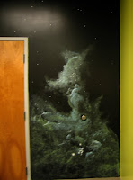
Here is the reference photo:

I also spent some time making a tutorial of this painting. I've been asked several times how do I do these paintings on the computer so I decided to put together a little tutorial showing the technique and steps that it takes to get one of these done.

For reference I use a Wacom Intuos Tablet for painting. The programs I use are Photoshop and Painter. Photoshop has a wonder brush engine, and can be used for more than photo editing/manipulation.


Step 1: In the beginning I keep everything very loose, making very broad strokes to get the overall feel and composition of the painting. The time I take here to get everything laid out will save me from having to repaint any major errors later.

Step 2: I liken this step to the great big scribble. I start to block in most of the shapes being careful to watch my values. Since this is a black and white photo I don't want to go to extreme in either the white or black just yet. I want to give myself some wiggle room to add in highlights and deep shadows later on. Plus at this stage, how is the picture reading, do I have the basic perspective correct, how are figures looking, etc? This is still the beginning so any changes needed can be quick and easy to fix.
Step 3: The figures are reading well, the composition is nice. Time to get rid of that "contrasty" look. I start to add values in, adding more white, getting a few deeper shades in there. Here is a great tip. If you want to know how well your values are registering all you have to do is squint. Yep thats right squint. Squinting helps to remove the mid range tones and allows you to focus on the highlights and darks. If you can "read" the image just by squinting you are making good progress.
Step 4: Time to take a breather, the hard part has past. I've got the figures, composition and my values are in good order. I can start to let go of the scribble and start to refine, refine and refine some more. At this stage I have a choice, do I stop and keep the image sketchy, or do I go on. I'll go on for this tutorial.
Step 5: Time to get some pure black in certain areas to bring out the figures some more. I also added in more detail to the wood and refined the figures some more.
Step 6: I noticed a few issues with the figures, also added in more detail under the bench and added more shadow and depth.
Step 7: Texture. Lots and lots of texture. There were big areas of flat tone that needed to be broken up. Unfortunately while adding in texture I lost some of the detail of the wood planks, so I'll have to go and repaint a bit of those.
Step 8: After another hour of refining it is finally finished. Time to sign it, watermark and post it!

If you have any questions feel free to email me. My email is located in my profile or in the watermark of my paintings.

Tuesday, May 25, 2010

Daily Sketch - 5.25.2010

Today's daily sketch. I used a reference from Flickr.

Monday, May 24, 2010

Daily Sketch - 5.24.2010

A quick little figure study of the statue "Winged Victory of Samothrace".

Friday, May 21, 2010

Daily Sketch - Friday 5.21.2010


Today's latest sketch. I decided to keep the strokes loose in order to keep things quick and easy.

Thursday, May 20, 2010

Sketches

Been busy lately, but have decided to spend my lunch time and any other free time during the day doing some sketches. I need to keep the practice up. Time for each sketch ranged from 1 hour to 3 hours. Check back every couple of days as I hope to have at least one new sketch every other day. 15 minutes left for lunch, time to get started on another!

Tuesday, March 30, 2010

Clarity - Storyboard Concepts


These 3 images are a few of some storyboards ideas I've put together for a new sermon series intro for the local church I attend. The idea of the intro is that it will be shot using live action footage and these images represent, loosely, the location in an area of town I'll be doing this. The monotone palette represented here will be what the final product will look like. I won't go into detail all about the intro, but wanted to start posting my works in progress. In case you are wondering, these are not photos that I've taken but "painted" so to speak using various brushes in Photoshop to quickly get them onto paper. The next step is to put together an animated playblast using these drawings going through the scene to check for style, motion, timing and overall if this will either be cool or lame. Total intro length will be 30 seconds.